Colour
Overview
To maintain consistent and engaging digital interfaces across all products and experiences, extended guidance around colour usage is provided. These foundational principles are intended to create visual balance, reinforce brand identity, and support accessibility throughout the UI design.
Colour anatomy
SaltDS’ colours are built on a balanced, neutral colour palette, using subtle greys to create clear content zones. Primary blues are reserved for primary actions, while other colours are applied selectively to support meaning and hierarchy.
Colours can add meaning to an experience, highlight key UI elements, or create associations with similarly coloured components.
Neutral colours
Neutral colours are used across most backgrounds, text, and UI elements. While typically meaning-agnostic, they can suggest states such as disabled or inactive.
Structure
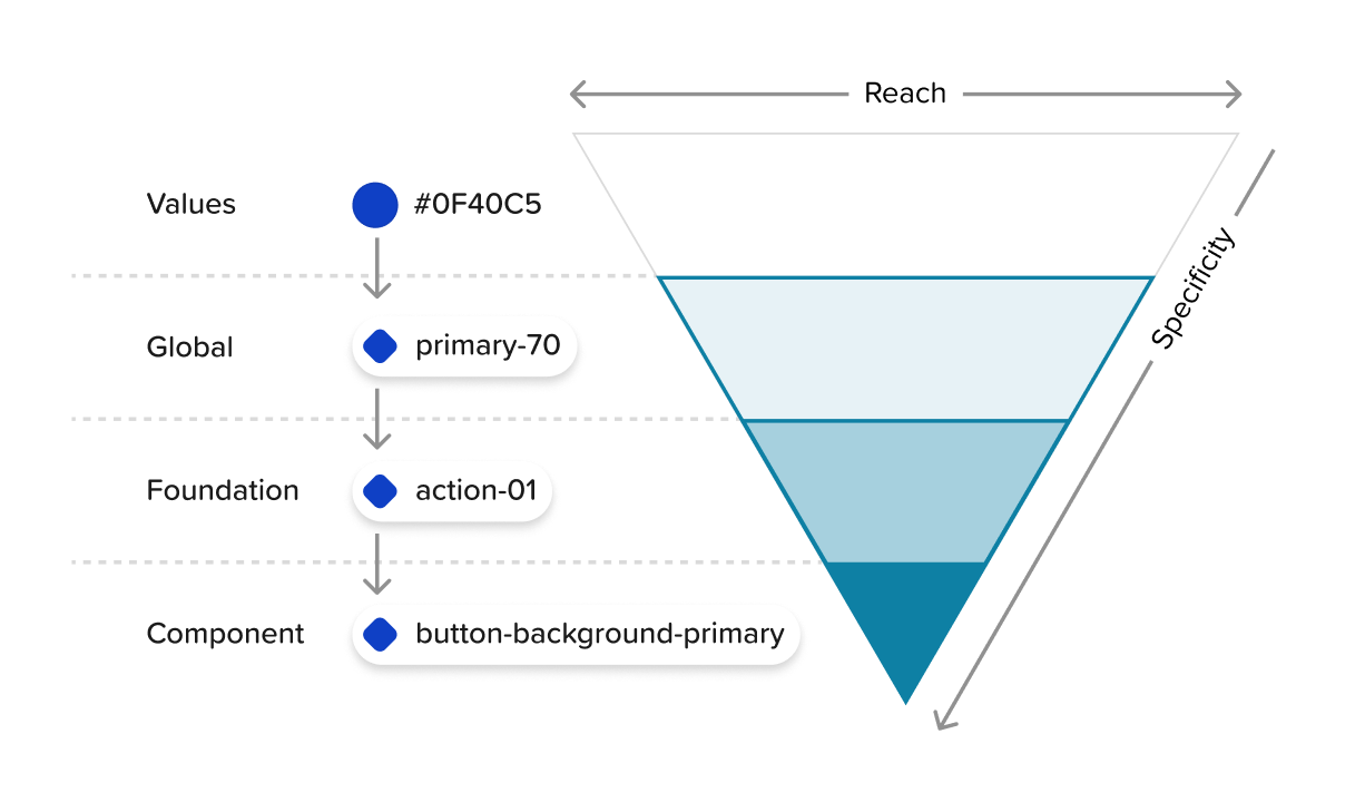
Colours in SaltDS are organised into three distinct tiers.
First is the Global palette, which defines the full range of available colour values. This includes neutrals (greys), a primary colour, three accent colours, and status-based colours for danger, caution, valid, and information. Each colour is unique and referenced only once.
Next is the Foundation layer, where functional meaning is assigned to these global colours. Here, values become tokens such as text-primary, action-01, and success-01 and are used to express interactive, UI, and denotative states etc.
Finally, Component colours apply these foundational tokens to specific UI elements. For example, action-01 becomes button-background-primary when used within the button component.
Tokens
Colour tokens provide a consistent, reusable, and scalable way to apply colour across the design system. Rather than relying on hard-coded values like hex codes, tokens abstract usage from value—enabling easier updates, theme flexibility, and support for features like inline theming or light and dark modes.
Each token has a role and a value. The role defines what the token is used for (e.g. text-secondary), while the value is the actual colour (e.g. a hex code) applied based on the active theme. Token names and roles remain consistent across themes, but the underlying value changes. For example, $text-secondary may map to neutral-70 in a light theme and neutral-30 in a dark theme.
Token names
For quick reference, a token’s role is reflected in its name structure, helping ensure tokens are correctly applied. To do this, SaltDS uses an object-base-modifier structure for its token naming. The first part of the name indicates the object, or component element the colour applies to – such as button, link, or label. The second part (base) specifies a category or property that the token will affect, such as background, weight or top. Lastly, the modifier indicates any additional traits that could be used to differentiate between variants, states or scale such as primary, hover or xl.
Not all tokens include an object, base and modifier but simply use what is needed to describe their usage effectively, for example $text-primary, $padding-01 and $font-weight-rg.
Interaction states
There are five interaction states defined with tokens (hover, active, focus, disabled and error). Interaction tokens are signified by the addition of a state name at the end of the token name. For example, the $button-background-primary hover state token is $button-background-primary-hover.
Hover
Hover is a subtle visual change that appears when a mouse cursor moves over an interactive element. Hover states are identified by the suffix “-hover” added to the end of the token name, such as $button-background-primary-hover.
Hover state token values are usually two steps lighter than the base colour on the palette scale. Suitable interactive colours have been selected based on accessibility and clarity, and are indicated by the action token base. These colours are found within the foundation palette.
Active
The active state indicates a press or selection interaction – such as a click, tap, or key press—on an interactive element like a button. Active states are identified by appending -active to the token name, for example, $button-background-primary-active. In SaltDS, these values are typically two full steps darker than the base colour on the palette scale. For instance, if the base colour is Primary 60, the active state might use Primary 80 to enhance visibility and reinforce feedback during the interaction.
Focus
The focus state highlights the currently selected element when navigating with a keyboard or assistive technology. In SaltDS, focus is typically shown with a 2px outline, making the element visually distinct and easy to locate. To maintain consistency and clarity, each theme uses a single dedicated token ($focus-01) to control the colour of focus-ring indicator across components.
Focus states are required on all interactive elements and must meet a minimum 3:1 colour contrast ratio for accessibility. To achieve this contrast, a lighter inset border is sometimes applied between the element and the focus-ring, ensuring clear visibility without overwhelming the component’s design.
Disabled
A disabled state is used when a user cannot interact with a component due to permissions, dependencies, or pre-requisites. Disabled components are entirely non-interactive – they do not respond to hover or focus and are visually de-emphasised. As they are not intended for active use, they are not subject to WCAG contrast requirements.
Regardless of the component’s base colour, disabled states are always styled using the neutral colour family. Styling varies based on the component’s structure and layering. SaltDS has a dedicated set of disabled colours that can be used on all components to achieve their disabled styled.
Feedback colours
The feedback colour palette is used to visually represent key UI states; info, success, warning, and error. It ensures consistency across components that display feedback, such as toasts, alerts. By using this standardised palette, the interface communicates state changes clearly and predictably to users.
Expressive colours
The expressive colour palette brings personality and energy to some components. It goes beyond the functional colours to help set tone, mood, and emphasis throughout the interface. These colours can be used to highlight important content, create visual interest, or support brand identity. When used thoughtfully, expressive colours add depth and richness without overwhelming the core UI.
Accessibility
Using multiple forms of contrast is essential for creating user-friendly and accessible interfaces. Following accessibility standards and best practices ensures colour choices are effective, inclusive, and easy to interpret across all user needs.
Contrast ratios
Contrast refers to the difference in brightness between two elements, which impacts how easily users can read or distinguish them. The Web Content Accessibility Guidelines (WCAG) define minimum contrast ratios to support legibility: small text (under 24px) must meet at least a 4.5:1 ratio, while large text (24px and above) needs a 3:1 ratio. Visual elements like charts and icons also require a 3:1 ratio.
The SaltDS palette consists of twelve tonal steps – Black, White, and ten incremental shades per hue. The table below shows the minimum step differences needed to meet standard contrast ratios between any two colours.